 "Arch Duke Maxyenko, Shit Talk Extraordinaire" (arch-duke-maxyenko)
01/22/2014 at 18:58 • Filed to: None
 1
1
 16
16|
"Arch Duke Maxyenko, Shit Talk Extraordinaire" (arch-duke-maxyenko)
01/22/2014 at 18:58 • Filed to: None | 1
| 16 |
oh well
 Velocity- Peuguette Connoisseur
> Arch Duke Maxyenko, Shit Talk Extraordinaire
Velocity- Peuguette Connoisseur
> Arch Duke Maxyenko, Shit Talk Extraordinaire
01/22/2014 at 19:01 |
|
Your design was better.
 ihm96
> Arch Duke Maxyenko, Shit Talk Extraordinaire
ihm96
> Arch Duke Maxyenko, Shit Talk Extraordinaire
01/22/2014 at 19:04 |
|
what was your design?
|
Arch Duke Maxyenko, Shit Talk Extraordinaire
> ihm96
01/22/2014 at 19:17 |
|
 Stef Schrader
> Arch Duke Maxyenko, Shit Talk Extraordinaire
Stef Schrader
> Arch Duke Maxyenko, Shit Talk Extraordinaire
01/22/2014 at 19:18 |
|
Needs more robot dinosaurs and rainbows.
|
Arch Duke Maxyenko, Shit Talk Extraordinaire
> Velocity- Peuguette Connoisseur
01/22/2014 at 19:18 |
|
Thanks, people didn't like it I guess.
|
Arch Duke Maxyenko, Shit Talk Extraordinaire
> Stef Schrader
01/22/2014 at 19:19 |
|
|
ihm96
> Arch Duke Maxyenko, Shit Talk Extraordinaire
01/22/2014 at 19:20 |
|
Haha thats great
 Pessimippopotamus
> Arch Duke Maxyenko, Shit Talk Extraordinaire
Pessimippopotamus
> Arch Duke Maxyenko, Shit Talk Extraordinaire
01/22/2014 at 19:31 |
|
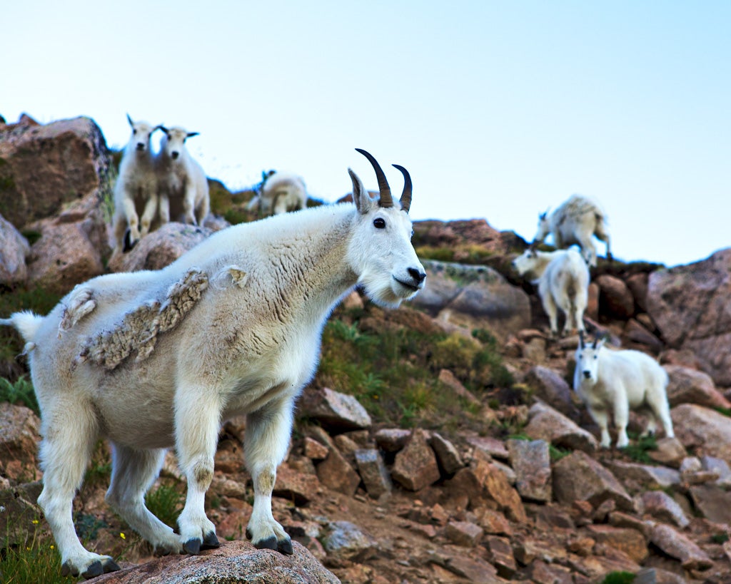
A la Pink Pig, eh?
|
Arch Duke Maxyenko, Shit Talk Extraordinaire
> Pessimippopotamus
01/22/2014 at 19:34 |
|
yeah, but with US standard goat cuts,
|
Pessimippopotamus
> Arch Duke Maxyenko, Shit Talk Extraordinaire
01/22/2014 at 19:46 |
|
Goat eh? Clever.
|
Arch Duke Maxyenko, Shit Talk Extraordinaire
> Pessimippopotamus
01/22/2014 at 19:47 |
|
Kinja'd
|
Pessimippopotamus
> Arch Duke Maxyenko, Shit Talk Extraordinaire
01/22/2014 at 19:48 |
|
How about now?
|
Arch Duke Maxyenko, Shit Talk Extraordinaire
> Pessimippopotamus
01/22/2014 at 19:55 |
|
Yup
 Dusty Ventures
> Arch Duke Maxyenko, Shit Talk Extraordinaire
Dusty Ventures
> Arch Duke Maxyenko, Shit Talk Extraordinaire
01/22/2014 at 20:03 |
|
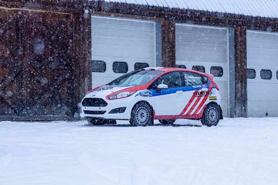
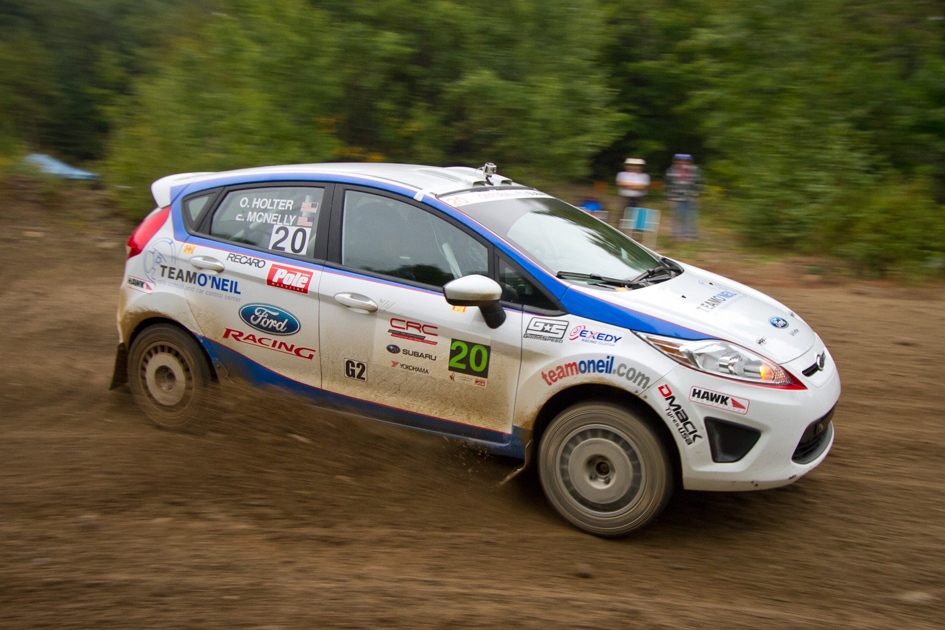
Stef's sad because they took Mrs Block's livery off the car
|
Dusty Ventures
> Arch Duke Maxyenko, Shit Talk Extraordinaire
01/22/2014 at 20:17 |
|
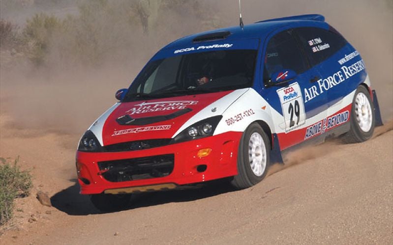
Don't take it personally. Team O'Neil's had a tradition of patriotic red, white, and blue schemes since Tim was driving the Air Force focus in the late '90s/early 00's. Tim really liked your design (I talked to him last week), the problem was he wanted something a bit more familiar, more immediately recognizable as a TON car. They also saved a couple hundred bucks on vinyl by leaving that much white.
Personally I think they goofed with those red lines. Makes it hard to read the logo.
|
Arch Duke Maxyenko, Shit Talk Extraordinaire
> Dusty Ventures
01/22/2014 at 20:22 |
|
If they would have reversed the stripes and had them come from just behind the headlights and ended them on the bottom of the drivers door it would be much more pleasing to the eye.
It's nothing personal, it only took me 30 min of dicking around in photoshop. Maybe if I ever do a LeMons car, I'll use it.